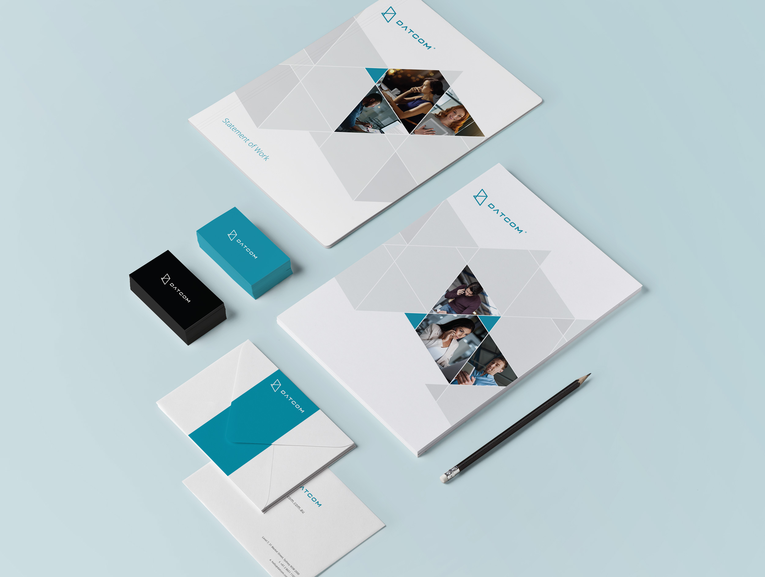
Branding
Datcom Cloud
Overview
Fluidx were approached by Datcom Cloud, an Australian National IT Services company who were looking to give their brand a refresh. This update in company image was in line with a focus on cloud services, coupled with an official rename to Datcom Cloud. This was also a chance to give their website an overhaul to reflect their updated branding and increase sales leads and conversion through this channel.
Challenges
The new brand image had to appeal to a variety of audiences, from business owners and IT Managers to CIOs.
The new Identity
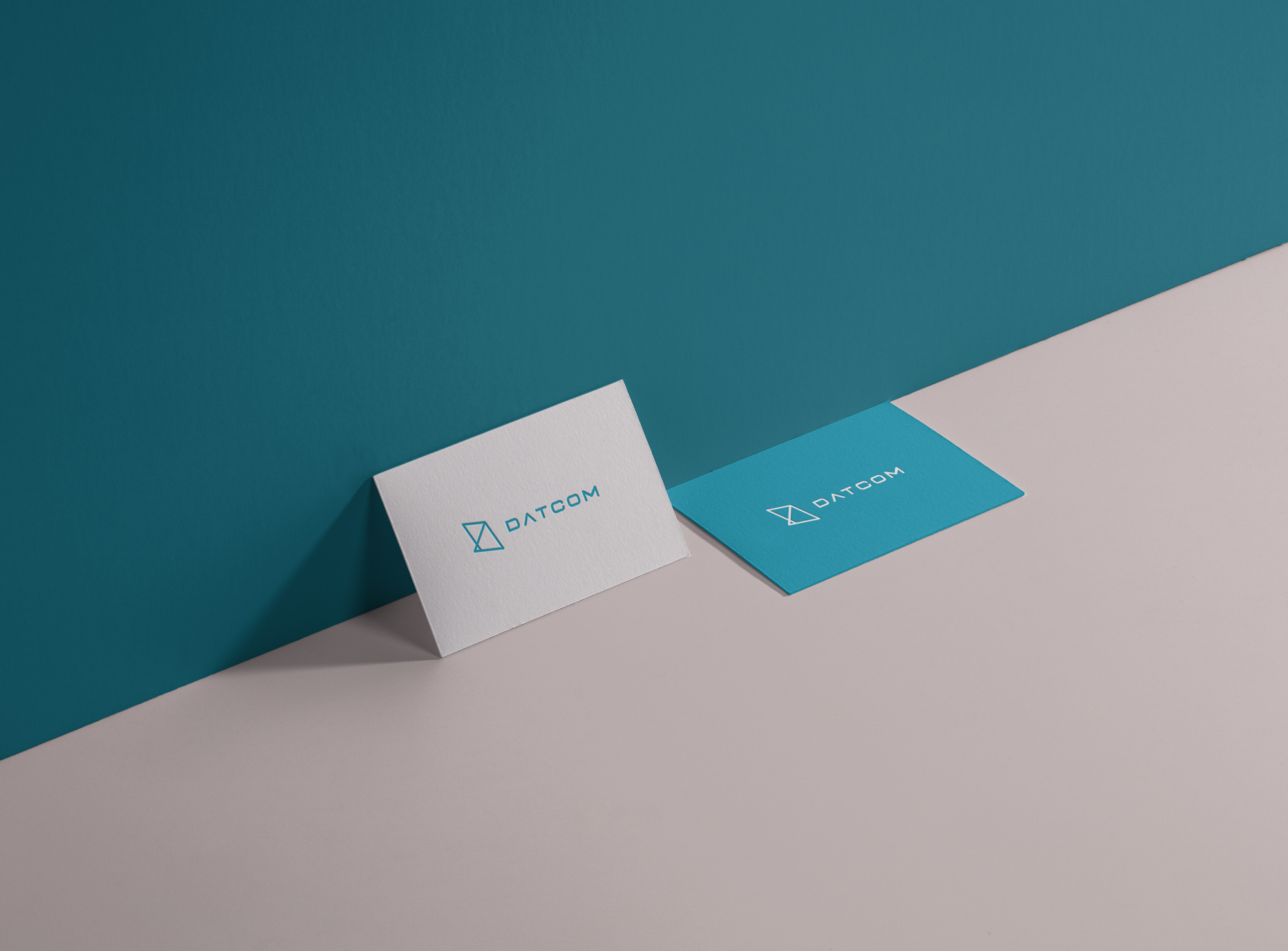
We chose to combine the fluoro green/blue together to form a new colour, aqua. We refreshed the font by thining the original font and added curves on the edges to give it a more techy vibe. Finally, the triangle symbol was kept although it was reformed in a more a modern “young” touch and became the icon of the logo.
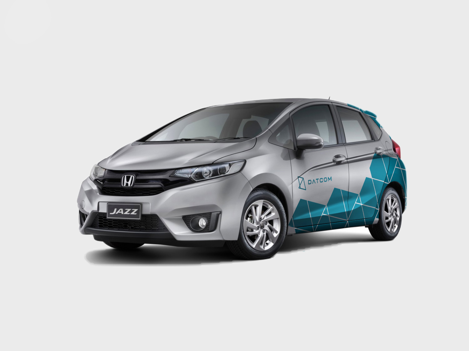
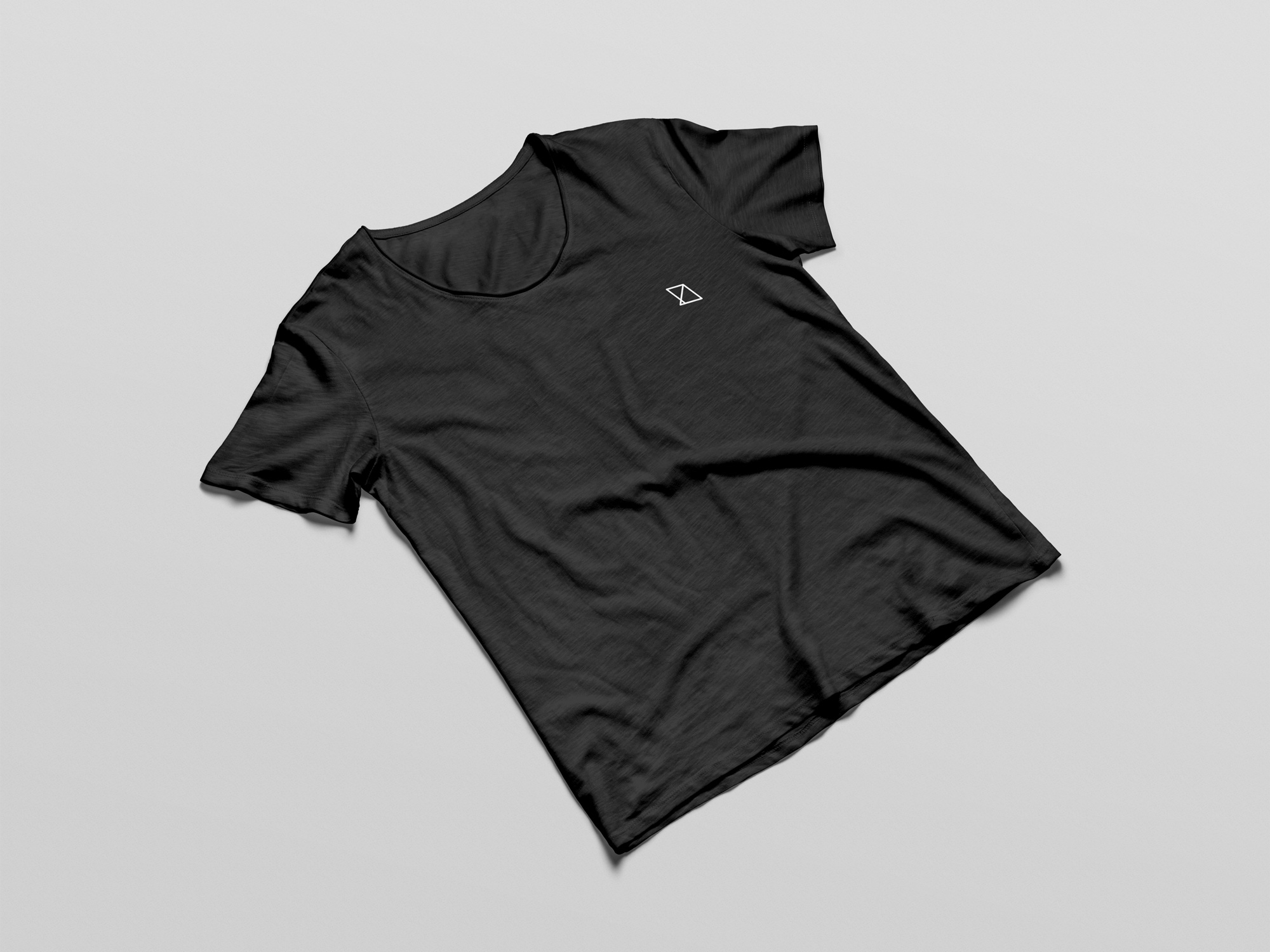
We also provided brand assets for Datcom Clouds to apply across business cards, sale templates, car decals and uniforms – consistent with the new website and marketing materials.
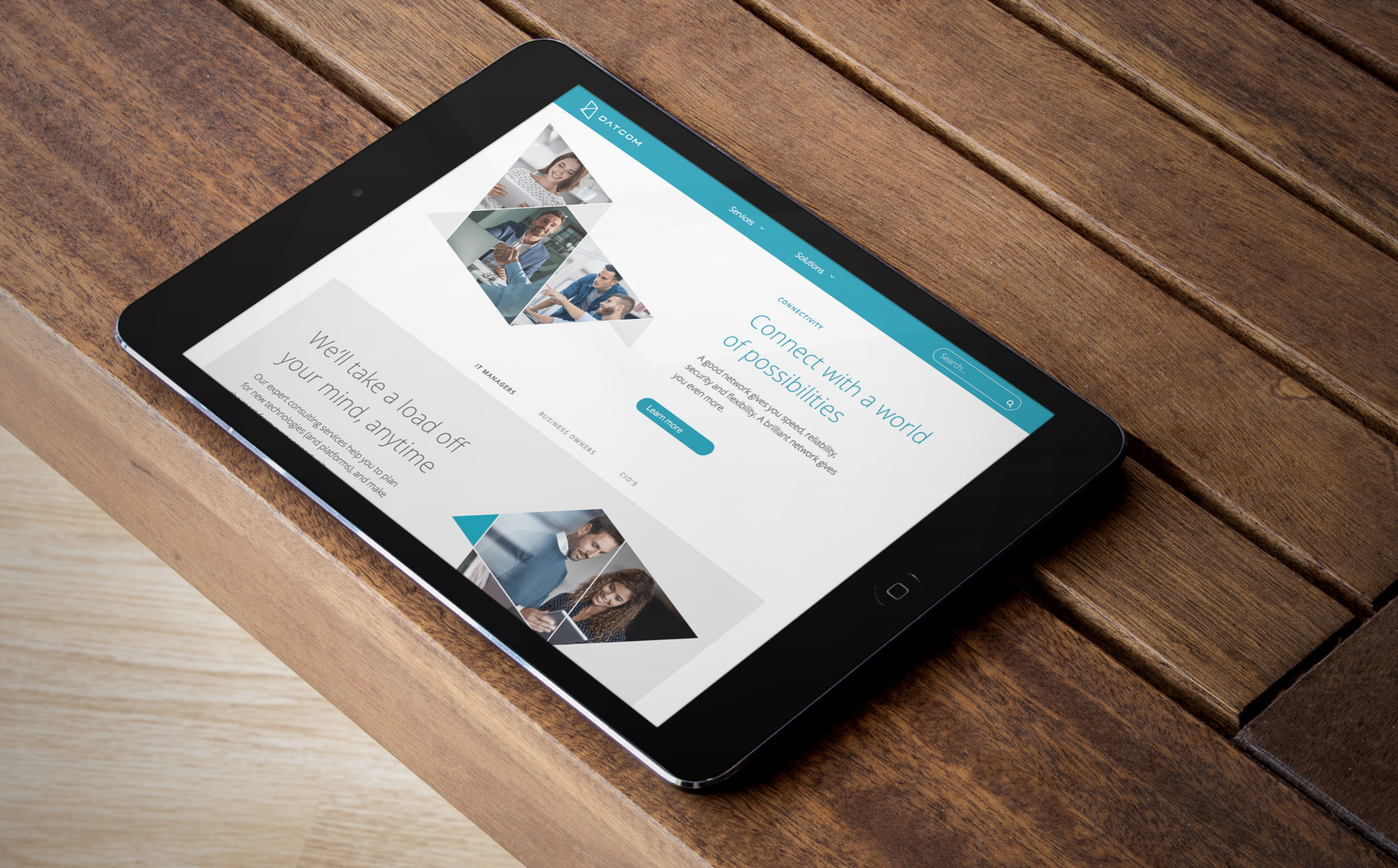
Website Redesign
Rather than a simple re-design of the existing website, Fluidx approached it from a ground level and strategic point of view, using expertise in the field to determine the optimal user journey for generating leads as well as providing information for interested and existing customers.
Apart from the aesthetic part of the website redesign, Fluidx were also heavily involved in creating a new language and tone of the website. As Datcom Cloud is an IT company, the balance between using easier to understand terminology as well as referring to specific terms was a challenge. All website copy was written from the ground up and passed through a thorough feedback and review process with Datcom Cloud management to ensure authenticity and accuracy.