Hanaku Cosmé
Branding

Hanaku Cosmé

HANAKU is a Japanese cosmetics brand aimed at the higher end market. The brand’s first product was HARUKA Ginza, a BB cream that was launched in the Vietnamese and South-East Asian markets.

The brief was to create a cosmetics brand that felt sophisticated and feminine, while still retaining elements of the brand’s Japanese roots. Typically, BB cream is seen as an affordable beauty product that is produced by drugstore brands. However, the packaging design of HANAKU needed to reflect the premium nature of the product, and stand out to consumers on the product shelves.

The Design

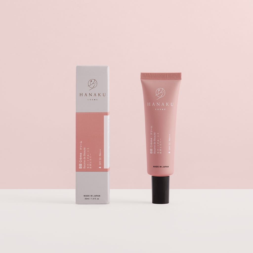
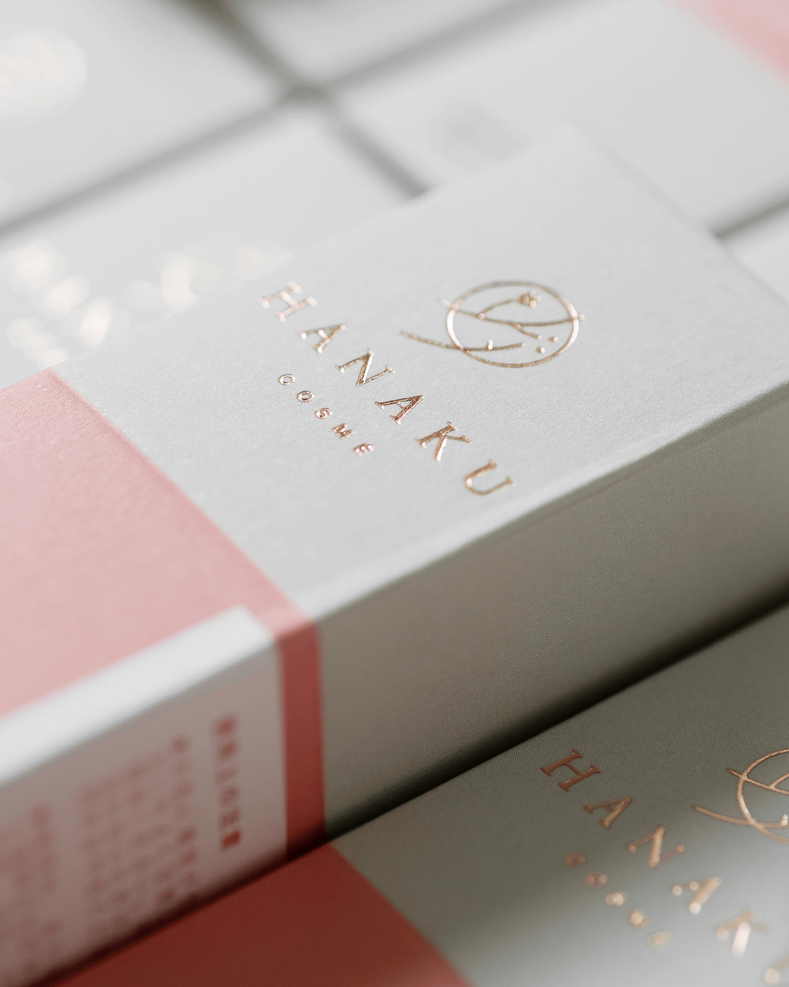
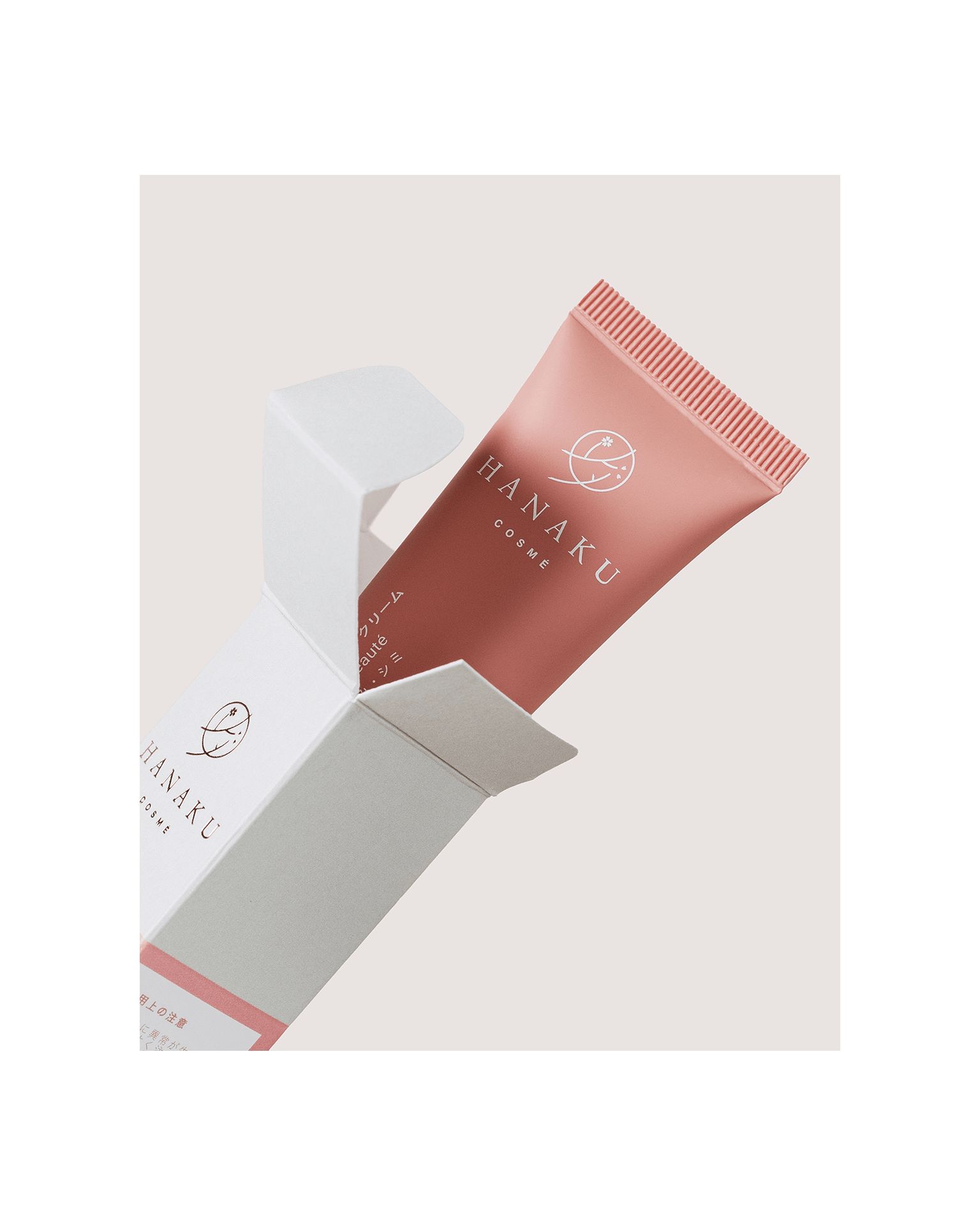
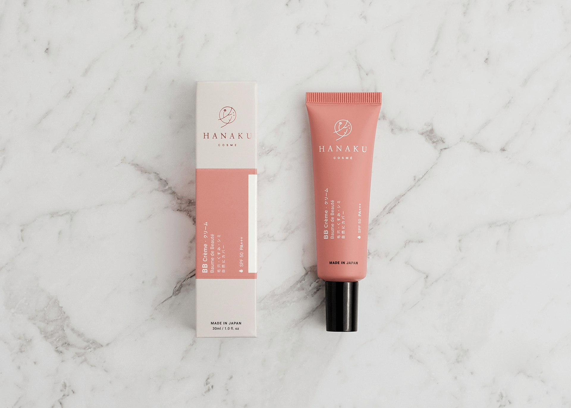
The final design incorporated elements of the HANAKU name, and makes subtle references to Japanese culture. Neutral, understated tones were chosen to reflect the elegant simplicity of Japanese aesthetics. Furthermore, shades of pink were incorporated to represent the cherry blossom, Japan’s most iconic flower.

The icon itself features a cherry blossom motif, with a subtle mountain as a nod to Mount Fuji. The design also features a hidden reference to the HANAKU name, with lines forming the characters ハナク.

Hanaku Cosmé
The Packaging

The box subtly mimics the noshi band, a common feature of Japanese packaging. The illusion of a noshi was created by printing and debossing lines where the edge of the band should be placed.

Japanese packaging tends to be quite wasteful, and often uses excessive wrapping and single-use plastics. However, by creating the illusion of the noshi, we cut down both the costs and waste involved, while still incorporating elements of Japanese culture.

Inspired by French fashion labels and Japanese culture, our aim was to create an original design that felt sophisticated, while keeping traditional Japanese elements intact.

Implementation

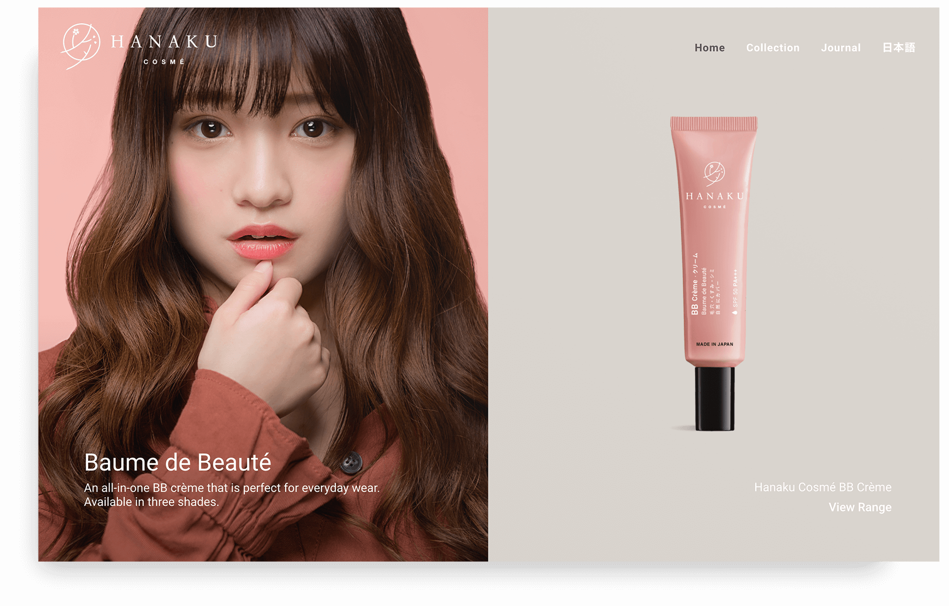
HANAKU’s branding was designed to be clear and focused. In particular, this is demonstrated by how copy and images are presented on the website, as bold text is accompanied by strong, large imagery.

The website copy was kept minimal, and designed to be simple and easy to understand for consumers. We avoided the use of lengthy jargon, focusing only on simple terms. Furthermore, we placed a stronger emphasis on images, using large imagery and bolded text to convey information about the product. This made the website easier to digest for a younger demographic, whose focus is more on visuals.

Hanaku Cosmé

Our minimal approach to HANAKU’s branding enabled the product to stand out. While the competitor BB creams are typically quite busy in design, HANAKU’s sophisticated packaging makes the product appear more high end, generating interest in the brand and its products.

This was further amplified through influencer marketing, as the photogenic packaging design appealed to social media users.’